Legal Compliance Management Web App
Optimizing legal compliance processes
Role
Duration
1 year (Ongoing)
Client
CMS Grau
The journey to human-centered solutions for legal practice
Problem
Users face outdated, complex workflows, scattered data, relying on assistance, causing inefficiency and frustration.
Solution
Legal compliance streamlined: centralized data, simplified tasks.
80%
Sprint Completion Rate
87%
Reduction of Side-Bar Pages
+90%
User Satisfaction During Testings
Rapid growth of pioneering legal compliance software
George, a legal compliance software for 30+ top Latin American companies, tracks real-time legal requirements, facilitates task management, file uploads, email notifications, and reports.
Photos by DERTEC S.A.C.
Yet no human-centered strategy
Struggling to rapidly respond to user complaints with no UX strategy, has turned George into a convoluted and unpleasant user experience.
Navigating the maze of legal compliance
User Pain Points
Feeling Lost in Navigation
Navigation through endless pages and tree structures requiring multiple clicks, leaves users feeling overwhelmed and disoriented, struggling to find information quickly.
Struggling with Task Assignments
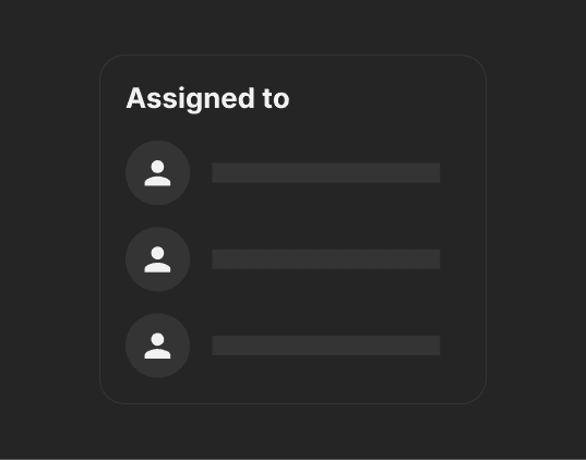
Users dread the complex, multi-step process of assigning tasks to their team, occasionally taking a week to complete. They often seek help due to stress and inefficiencies in the process.
Business Impact
Customer Turnover Threat
Users may drift towards competitors when given the opportunity due to the product's complexities and overall dissatisfaction.
Resource Drain and Stagnation
Tech support's time is dominated by user assistance and quick fixes, limiting resources for innovation, hindering progess, and putting the company at a competitive disadvantage.

How might we simplify tasks and navigation for happier users and better business results?
Making legal compliance a breeze through...
Intuitive Navigation
Familiar Workflows
Standardization
Empowering legal teams: A new UX era
Because legal compliance is enough of a headache already. *Disclaimer: Original content has been traslated to English for this case study.*
1. Simplified menu
Clear navigation and contextual understanding
It isn't just about aesthetics – it's about empowering effortless navigation with fewer pages, clear language and contextual awareness to boost productivity with ease.
2. Optimized task assignment
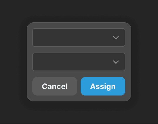
Streamlining teamwork with 2-step task assignment
Assigning tasks to your team shouldn't be a headache. With just a few clicks, bulk actions, and quick context, we can streamline decision-making and mitigate overwhelm.
3. Easy task completion
Tidy tasks, enjoyable work
Instead of multiple tabs chaos, each task now opens as a side panel, key data and CTAs are hierarchically displayed, and tabs organize information for easy access and quick task completion.
Project Takeaways
Adapting strategically: Two-phase launch
As a PM coming into a complex software setup with time constraints and a reduced team, I prioritized critical pain points in 2 launches to meet user and stakeholder expectations effectively.
Designing for business goals and user needs
It's easy to get carried away and overhaul every page. Due to business goals and constraints I had to prioritize redesign efforts, leveraging familiar workflows and UI libraries.
Fostering collaboration for better results
Implemented a culture of continuous improvement, through workshops and sharing research insights. We managed to foster a collaborative environment for continual improvement.


